Project Overview
Summary
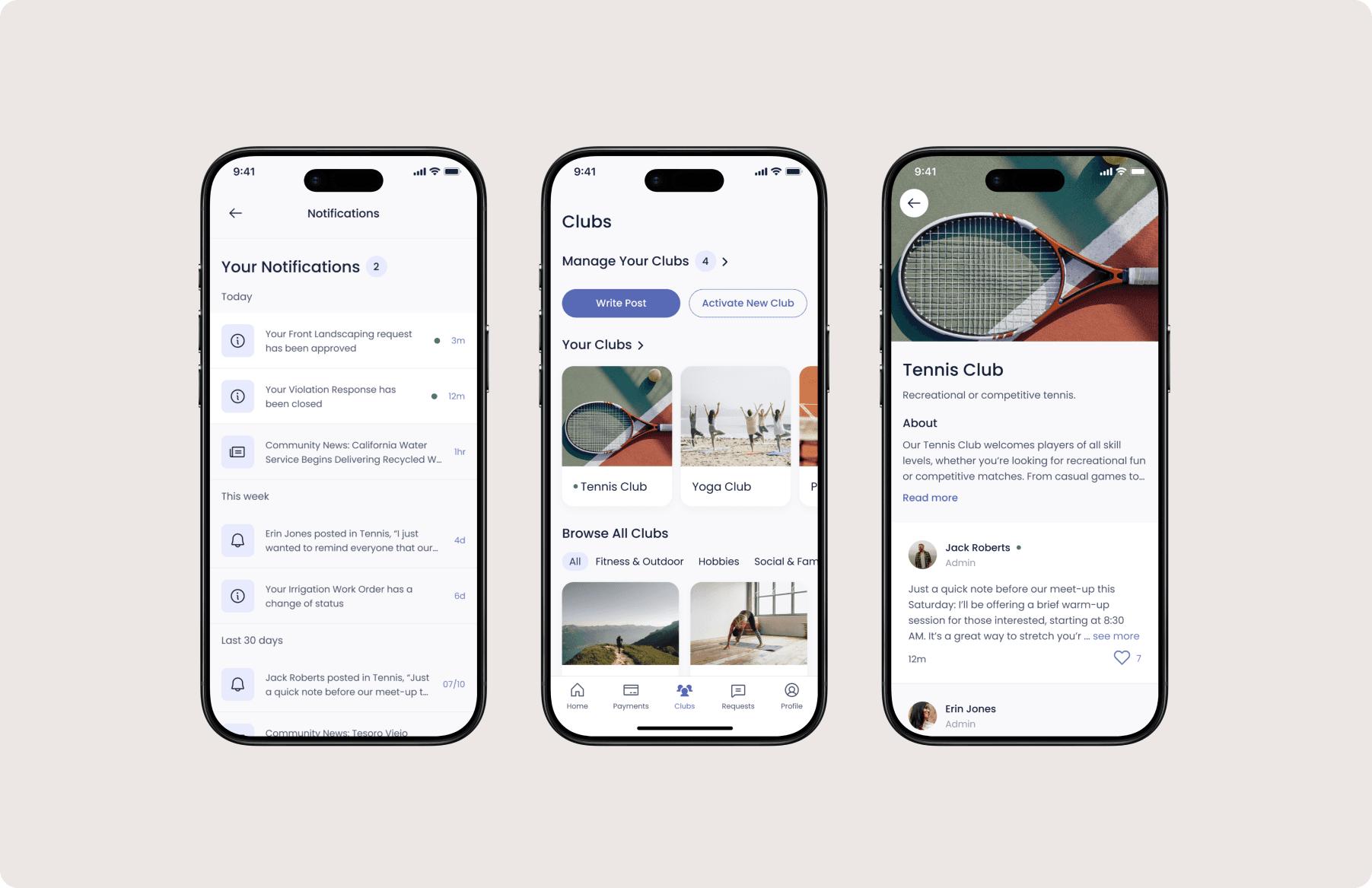
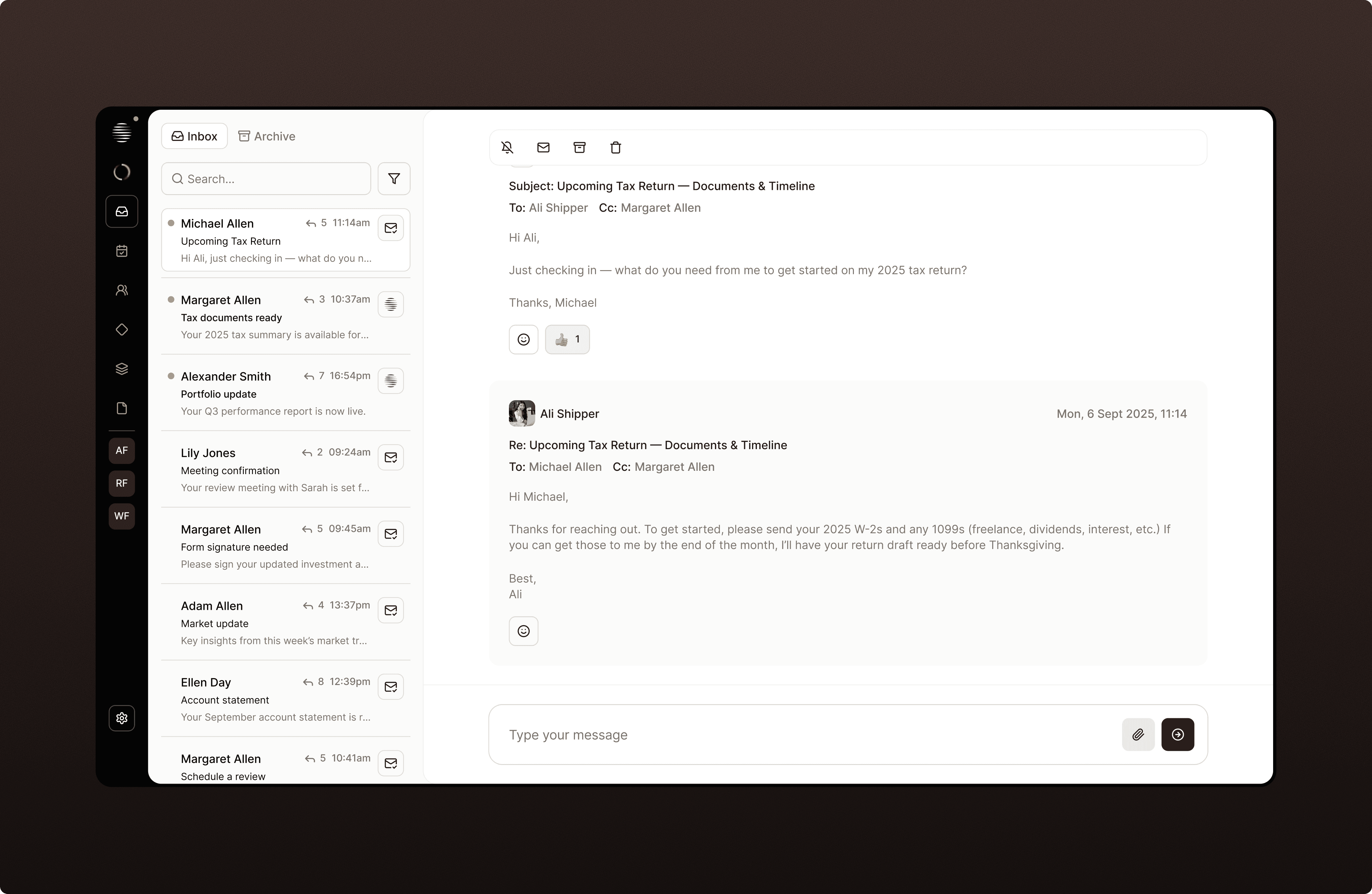
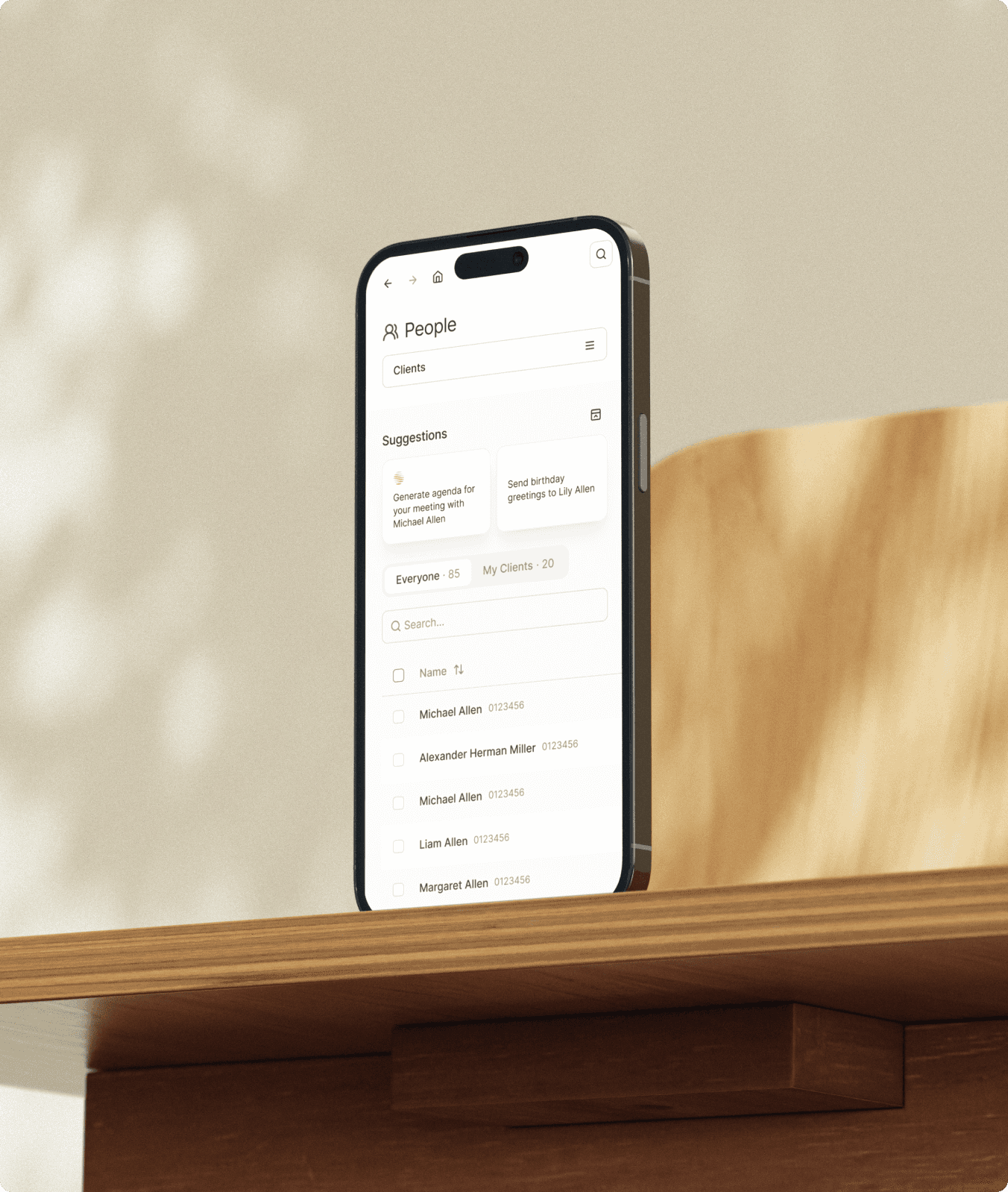
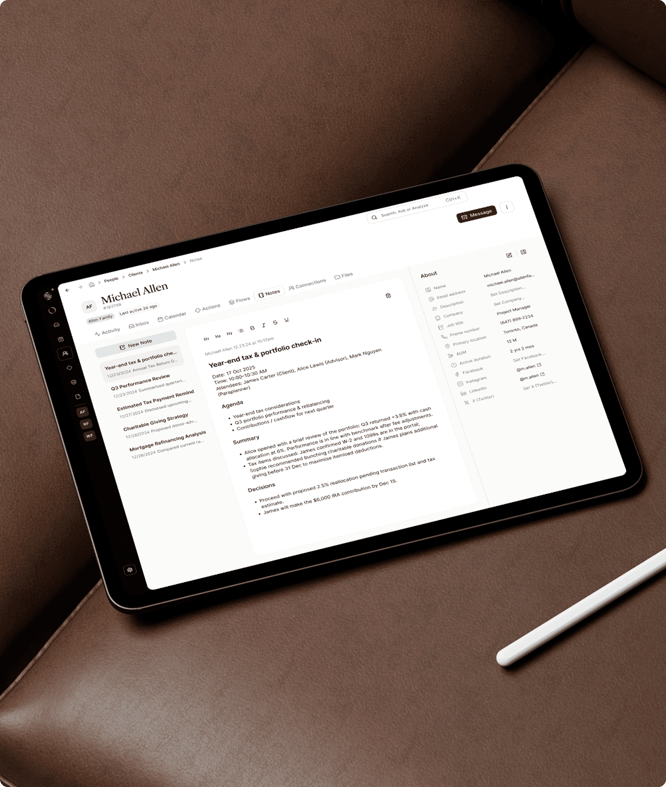
Continuum is an AI-driven productivity platform built for financial advisory teams. We designed the product from the ground up, starting with understanding user needs, then mapping the information architecture, creating wireframes, and delivering high-fidelity designs.
Key Problems + Why They Mattered
Time-Consuming Admin: Advisors spent hours on notes, summaries, and CRM updates, leaving less time for client relationships.
Fragmented Client Data: Information was scattered across systems, making it hard to get a full picture of clients.
Complex Workflows: Multiple steps for simple tasks slowed advisors down and increased cognitive load.
My Role
I worked as a Product Designer on the project, collaborating closely with another designer on my team and partnering with the Founders and Engineering team at Continuum. We defined the product from scratch, shaping the IA, mapping navigation, designing key flows, and setting the visual direction.
Project Goals
What We Set Out to Focus On
Create a dedicated workspace for advisors
Bring structure to complex advisory work
Design a calm, premium experience
Enable better collaboration with clients
Mapping the IA
Understanding How Pages Connect
To better understand the product and user needs, we started by mapping out the key pages and how they relate to each other. This helped us see the platform as a whole and understand how advisors would move through it during their day-to-day work.
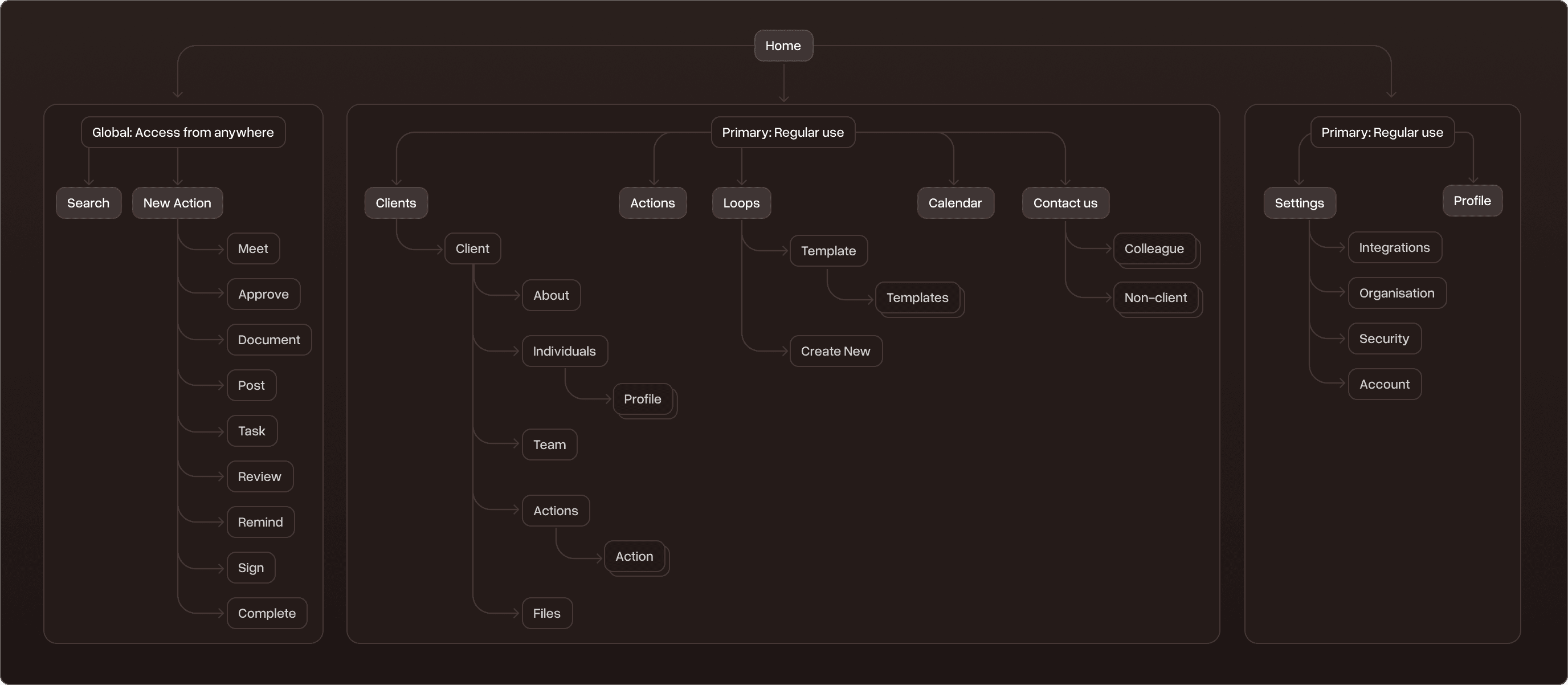
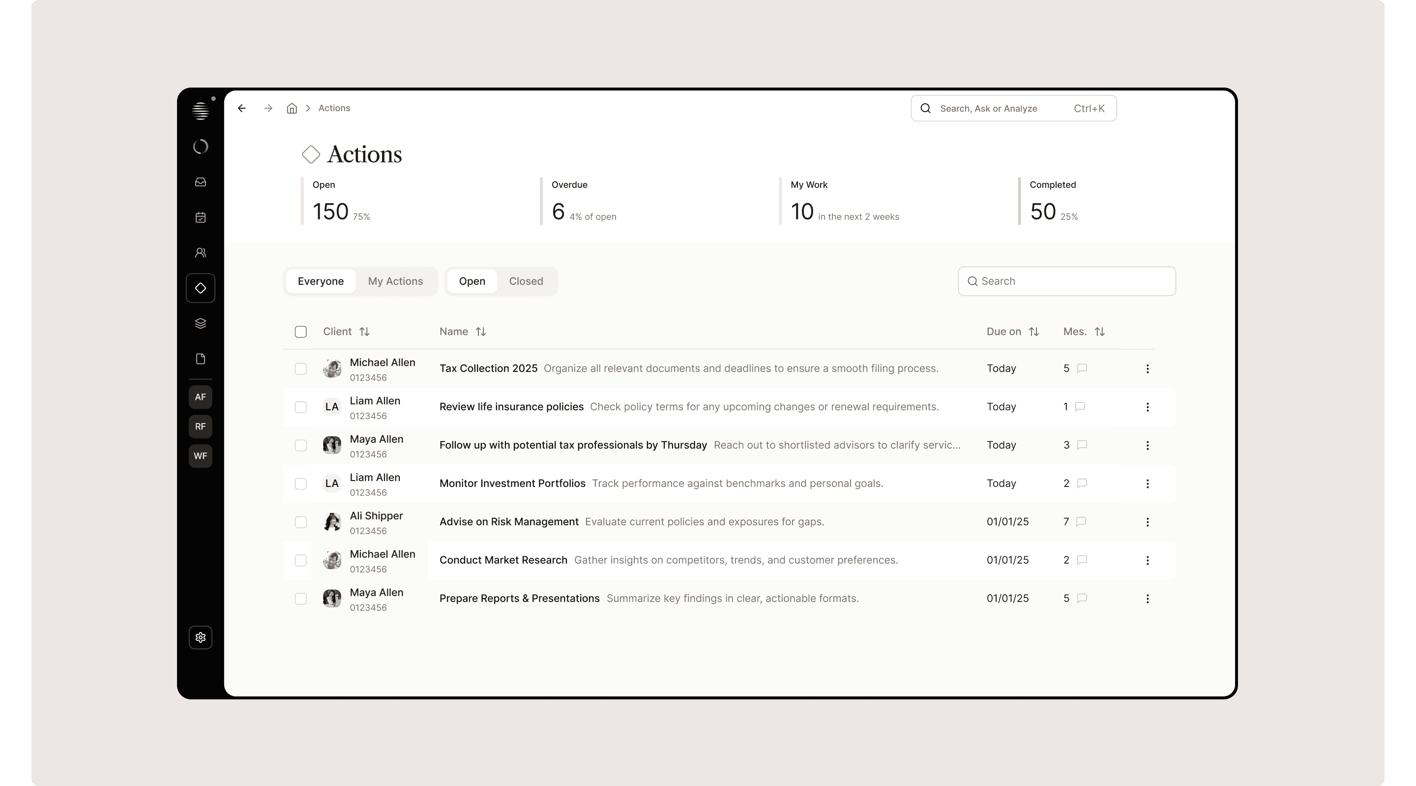
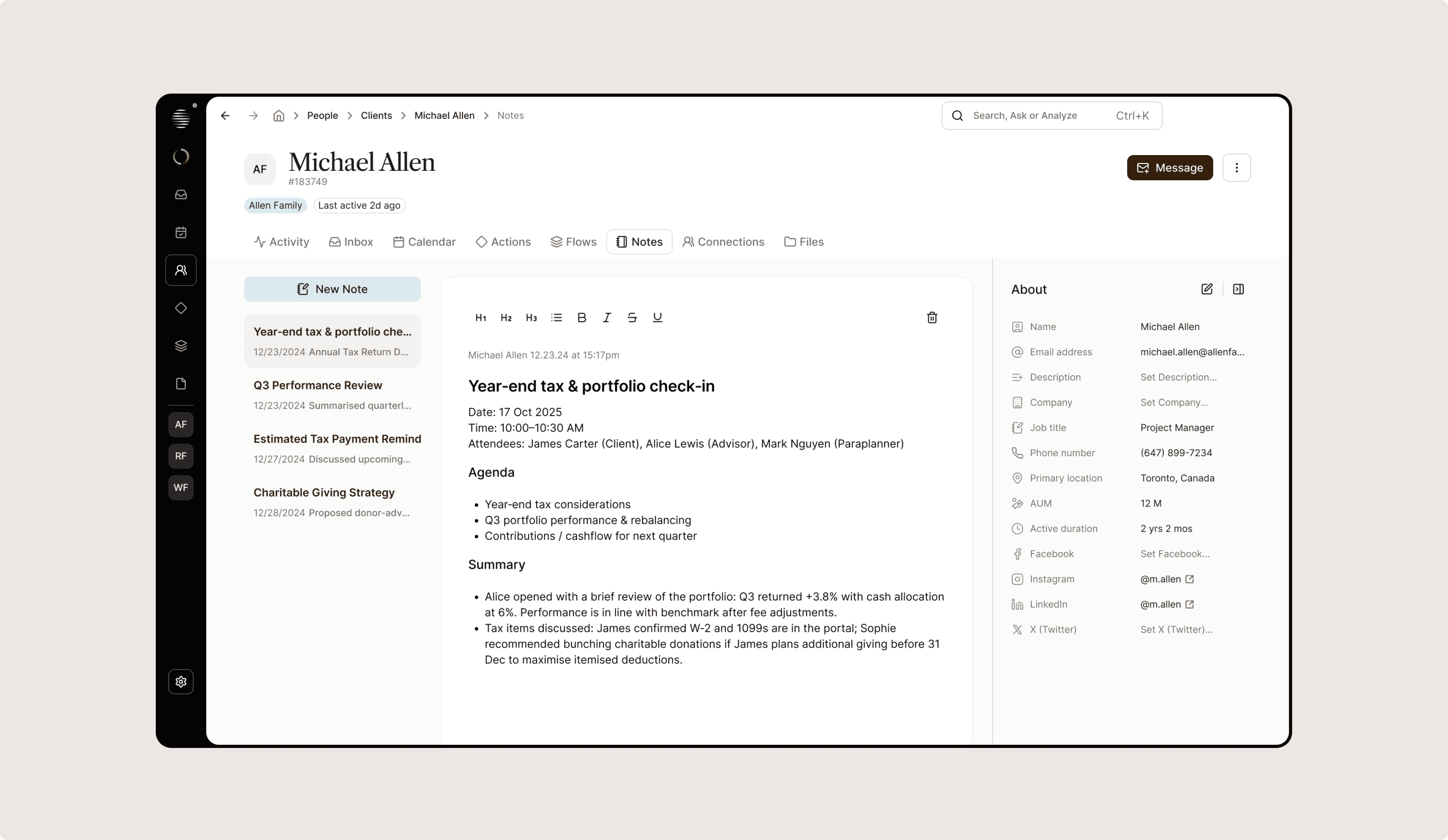
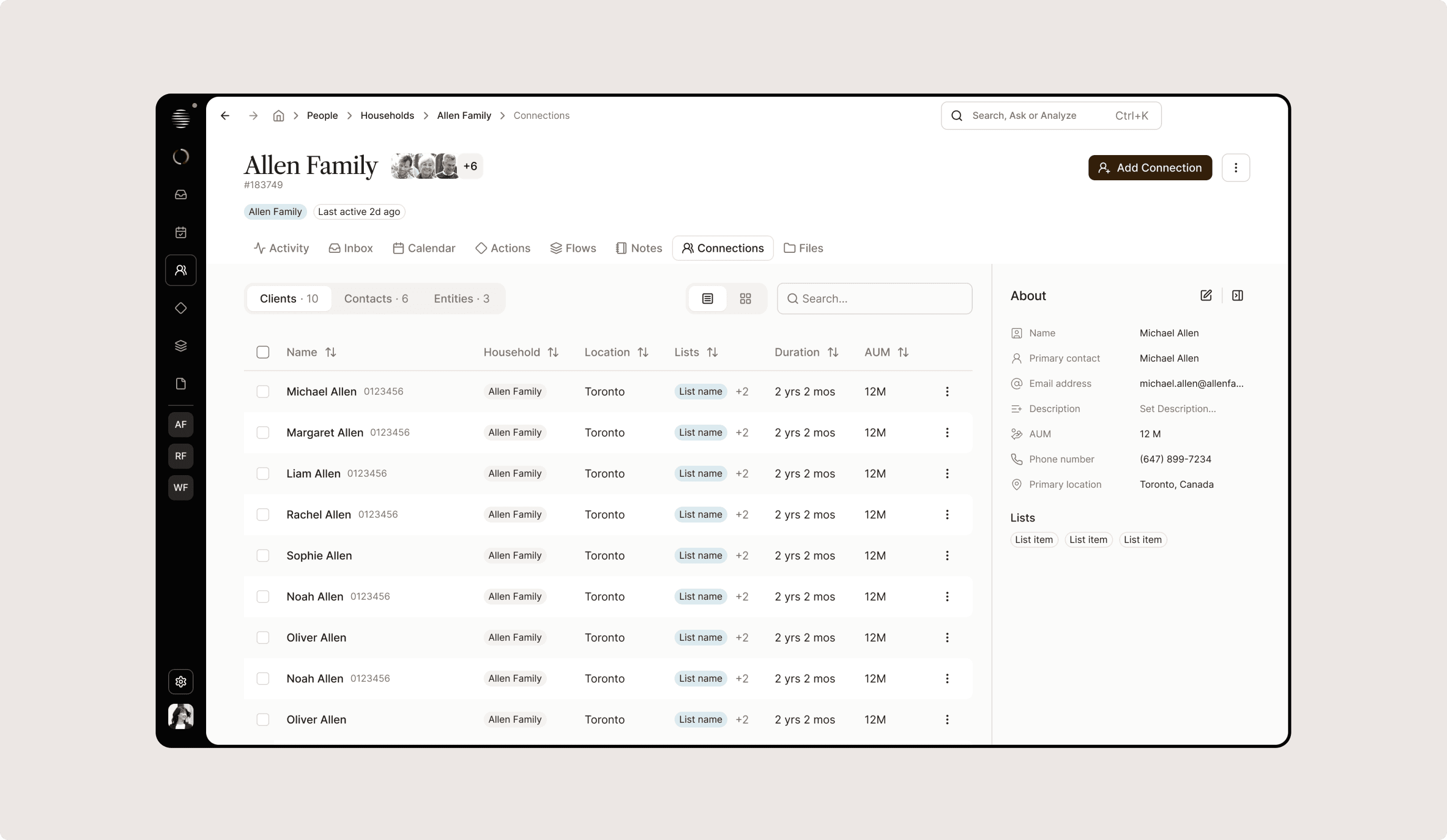
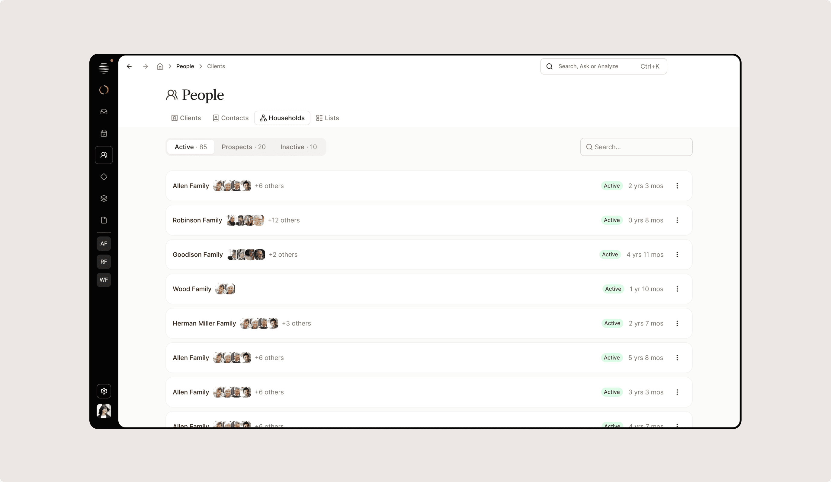
Scalable Navigation
Helping Advisors Stay Focused
We designed a left-hand sidebar to make it easier to move between clients and core sections without losing context. The goal was to keep it simple, predictable, and scalable as the product evolved.
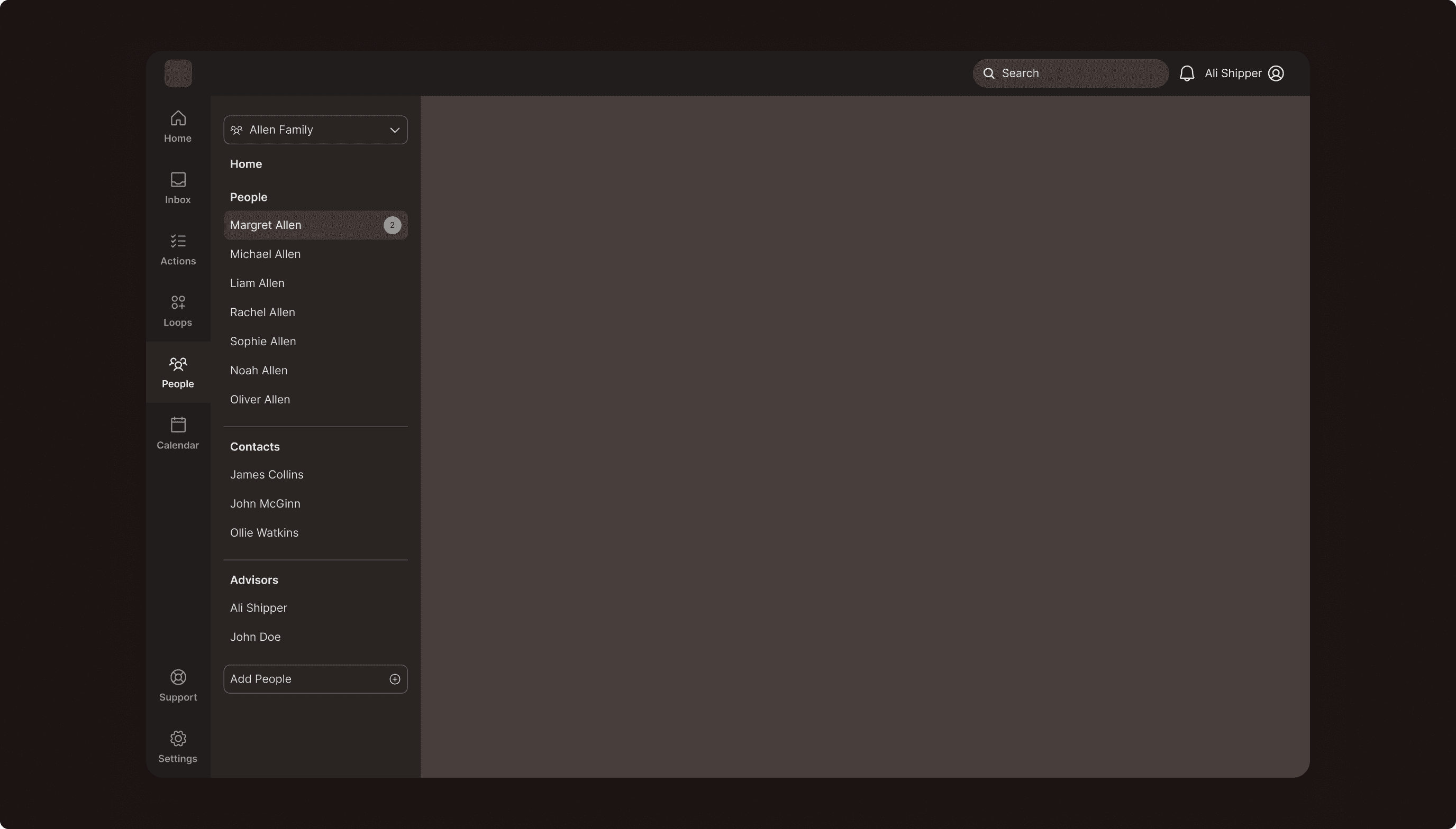
Lo-Fi Exploration
Wireframing for Fast Iteration
We created wireframes for fast iteration with the team. This allowed us to align early, ask questions, and adjust the structure as necessary.
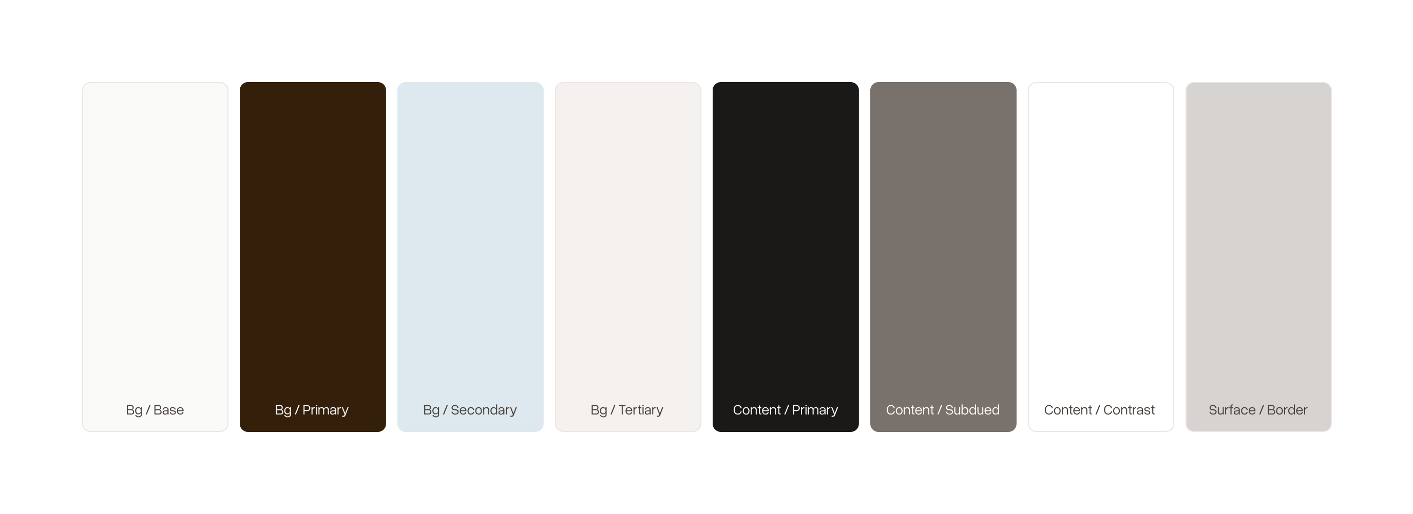
Color Palette
Calm, Premium Tones
We kept the visual language muted and minimal, using warm neutral tones and subtle accents to reduce visual noise and let important information stand out. The intention was to create something that felt premium and thoughtful.
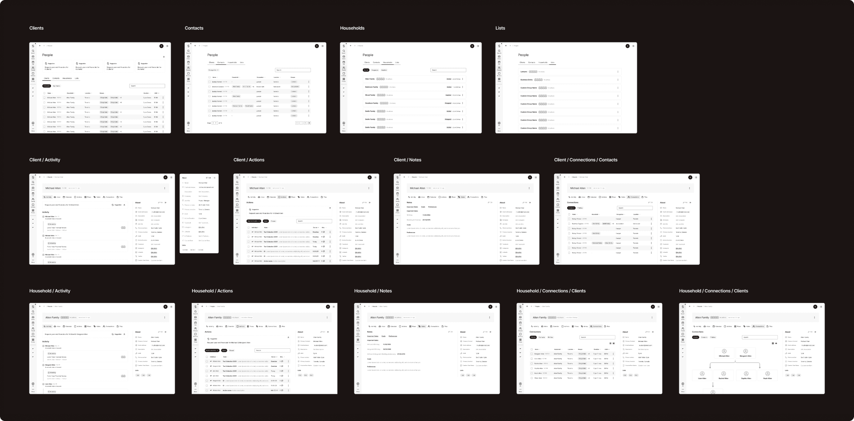
Design Decisions
Spacious, Calm Layouts
We focused on making the interface feel clear and manageable, even with complex information. We designed spacious layouts with plenty of breathing room to reduce clutter, and typography was structured to make it easy to scan quickly.
Reflections & Next Steps
Moving forward, the next steps for the product would focus on continuing to build out the advisor and client experiences, refining workflows, and testing how advisors use the platform in real scenarios.